
HSBC Data
Website Dashboard and Guidelines
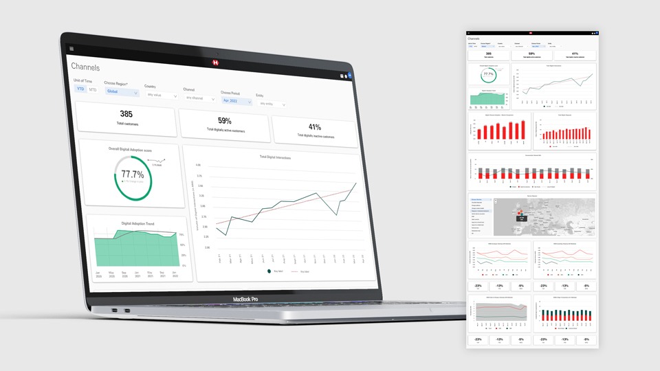
Website platform
Understanding the different teams around the business (global) metrics and KPIs to then map out users flows. The design was very much governed by the supplied data (or data streams) so this involved working closely with data teams and working out what could be done with the data. Creation of web pages using UI patterns.

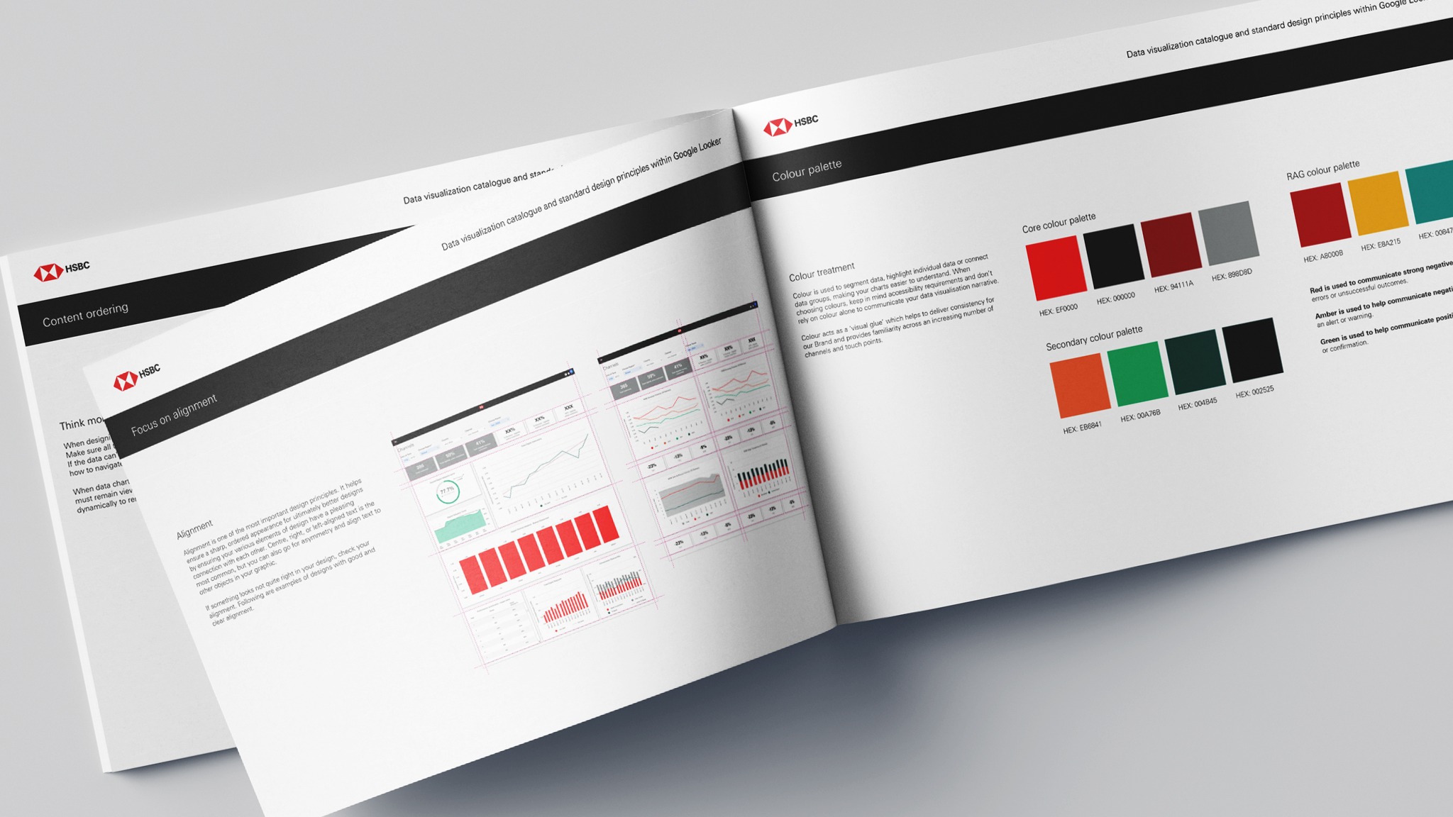
Design Guidelines and User Guide
Creation of a ‘data visualisation catalogue and standard design principles’ document. This document aimed to help stakeholders around the business become familiar with the platform from a dashboard process and design point of view. It talks about the simple native visualisations and the difference in custom visualisations too. The document explains use of typefaces, colours, focusing on alignment, consistency, content, ordering, hierarchy, accessibility, and best examples from the data. It also has great resource links to help understand the platform further.

